Case study 01

Society
AI career coach onboarding
Society is NSLS’s web-based AI career platform for its 2M+ student members, built for desktop and mobile browsers. Its career coach could only help once it knew a student, and most never got that far. I replaced an open-ended chat with structured tracks and put AI where it adds value. In the live product, 63% to 76% of students who start a track now finish it, and onboarding takes about 12–15 minutes instead of more than half an hour.
As lead product designer for Society, I owned onboarding from strategy to high-fidelity UI and handoff, working with the Head of Product, the Society team and the NSLS core team.
My wider role was the design strategy for bridging the NSLS member experience into Society. Onboarding was the first project I took on.
- Role
- Lead product designer
- Team
- Head of Product, Society team (PM, AI engineer, front-end developer), NSLS core team
- Timeline
- 2025 – 2026
- Outcome
- 63 to 76 percent
Context
A standalone career tool, a new brand, and hints of something much bigger: members didn’t know what Society was, or what they’d get from it.
The National Society of Leadership and Success (NSLS) is a leadership honor society with more than two million members across 800+ campus chapters. Society began as Ignite, a product an outside agency built under its own brand. It was first positioned as a “Career Accelerator”: a standalone experience for members who needed direction on their career path, answering the thing members told NSLS most often, that they felt unclear about their future.
The ambition was bigger than that. Over time Society was meant to expand and take over the NSLS brand, and the product already hinted at it, promising peer groups and mentors that didn’t exist yet. So members met three things at once: a standalone career tool, an unfamiliar brand, and hints of something larger. That created confusion and hesitation before anyone had answered a question.
I was the lead product designer for Society, responsible for the design strategy that bridged the NSLS member experience into it. I worked with the Head of Product, the Society team (a PM, an AI engineer and a front-end developer) and the NSLS core team. Onboarding was the first project I took on, and it is the one this case study covers.
Onboarding turned on a single payoff. Work through the flow and you’d get a career direction and a career statement: the coach’s read on who you are and where you’re headed. Everything was gated behind finishing, and nothing explained what the product was, what it would ask, or what members would get for the effort.
That background shaped how I worked. I wasn’t only fixing a flow; I was trying not to paint us into a corner. The structure, patterns and language had to hold up for the product Society was meant to become, so I started by breaking things down into pieces we could build on.
We shipped the redesign as a bet to prove before a wide release: invited past members first, then live to current members in NSLS’s Online and Virtual chapters, on the web, in desktop and mobile browsers.
Problem
Onboarding was one long chat: 76 inputs and more than half an hour of questions, and few who started it reached the end.
The original onboarding ran on two assumptions, and both were wrong. The first was build it and they’ll use it: that members would push through a long flow because the payoff at the end was worth it. The second was that a single chat interface was the natural home for all of it, because everyone talks to AI now, so a chat should feel familiar. Here it is, start to finish.
I didn’t want to guess at what was failing, so I gathered evidence from every side: I audited the live build end to end, watched session recordings, read back the actual chat responses, and talked to both students and chapter leaders. That is what told me which problems to prioritize, and in what order. It was also the only way to find them: one long conversation has no steps to count, so we couldn’t build a funnel or see where and why people were dropping off.
One long, continuous flow.
One unbroken thread: 76 inputs, nearly all open-ended, before a single saved result.
More than half an hour with nowhere to pause, and few who started reached the end. One student typed into the chat: 'i want to pick up where i left off.'
Self-contained tracks a student could enter, finish, and move through.
No sense of what it was for.
The flow set no expectations and never answered the question every student was asking: what's in this for me?
It opened on a deferred promise and closed, after every question, on a student typing 'now what do i do?'
Expectations set up front, and a required core that pays off in minutes instead of a promise held to the end.
An information architecture that hid the shape.
A student couldn't tell how long the flow would take, what each section was for, or how any of it tied to their goals.
The one progress cue crept and jumped, named nothing, and couldn't account for tracks nested inside tracks.
A clear information architecture, with progress at every level (track, section, question) and a menu of what's done and next.
AI monologues you couldn’t act on.
Every answer came back as a long AI paragraph that trailed off into 'talk more about it, or save and move on.'
No way to go back or expand; session recordings showed students stuck in conversational loops. Students said so in the chat itself: 'Wait can I go back and change my strengths' and, after being told to contact support to change an answer, 'Why is this so complicated of a process?'
AI pulled back to where it earns its place, reflecting a student's answers back and drafting from them, not narrating the flow.
No real end.
Even the Coach Chat that replaced the ending had no finish line.
Asked how to wrap up, the coach admitted there wasn't one, and said to email a staff member. Other students just typed: 'what do i do now'
A defined end to every track, and a saved plan the student walks away with.
The full teardown put a number on all of it: 76 inputs before a single saved result, network value never, 167 issues in all, every section graded with what broke and a fix proposed for each. The personality assessment alone asked 42 questions to measure four or five dimensions, and tested the same thinking-versus-feeling trait 17 times.
Insight
The chat interface promised a conversation the product never had.
The reframe was simple, once the evidence forced it: the chat was a disguise. It implied open-ended dialogue, but underneath it was a fixed, linear sequence of questions, a simple form the conversation had masked and overcomplicated. The chat didn’t add flexibility. It added effort, and it hid the structure that was already there.
So the problem wasn’t the AI. It was the interface we’d wrapped around it. What we were really collecting was structured, so it needed structured patterns, and the AI needed a sharper job than running the interview.
That job was reflection. The AI was at its best handing a student’s answers back: recapping what they had said, naming the insight in it, and tying it to the goals they started with. So AI moved out of the asking and into the reflecting, and that principle shaped everything that followed.
From that I proposed a set of principles for the redesign:
- Structure for the facts, conversation for the results. Forms and taps where the answer is simple; the coach only where talking helps.
- A track is a book; a section is a chapter. Each track has one goal and its own intro, and each section inside it opens and closes like a chapter.
- Say what’s in it for the student before asking for anything. Every section states what it covers, how long it takes and what they get.
- Show progress at the level the student is working at. Track, section and question, with a visible end.
- Let students go back. Review and change an answer without breaking the flow.
- The AI reflects; it doesn’t interrogate. It hands a student’s answers back as something they recognize.
- Build for where the product is going. Structure, patterns and language that new tracks, peer groups and mentors can slot into later.
My proposal to leadership also set the bar before anything was built: at least 70% completing onboarding, in under 12 minutes on average. It restructured the flow itself, pulling the personality assessment out as its own section and separating the coach chat from the tracks.
Current information architecture
Welcome
- Getting Started
Personal Insights Intro
- Discover Your Personality
- Professional Environment
- Social Situations
- Personal Growth
- Problem Solving
- Mental & Emotional Processing
- Strengths
- Inspirations
- Values
Career Clarity Intro
- Work Environment
- Living Environment
- Financial Needs
- Dream Job
- Career Statement
- Coach Chat
Proposed information architecture
WelcomeRequired
Personal InsightsRequired
- Professional Environment
- Social Situations
- Personal Growth
- Problem Solving
- Mental & Emotional Processing
Career ClarityOptional: recommended by the coach
- Strengths
- Inspirations
- Values
- Work Environment
- Living Environment
- Financial Needs
- Dream Job
- Career Statement
Coach ChatOpen after any track
- Personality sections, lifted out of a nested assessment into Personal Insights
- Strengths, Inspirations and Values, moved into Career Clarity
Decisions
Give students structure they can see, and use AI where it adds something structure can’t.
Decision
Fix the chat or replace it
Considered
Tune the conversation
Better prompts and guardrails, but students would still face an open-ended chat for a fixed set of questions.
Chosen
Structured tracks, AI where it adds value
Clear sections, standard inputs and visible progress, with AI focused on follow-ups, recaps and a coach conversation.
- Cost
- We gave up the conversational feel that stakeholders had already bought into.
- Pushback
- There was real buy-in for the chat, so replacing it meant spending that goodwill.
I didn’t start here. My first proposal still led with conversation, and I listed “users prefer forms over chat” as a risk, with a hybrid as the fallback. Testing made the fallback the plan: students wanted direction, the ability to go back, and a visible end. So we replaced the chat with structure and kept conversation for the one place it helped. It wasn’t an easy sell. Leadership and the team had bought into the conversational feel, and walking it back meant spending real goodwill, including my own earlier pitch. I made the case screen by screen, and that’s what won the team over.
Three short tracks instead of one long one. Onboarding had been one all-encompassing track bundling profile setup, personal insights and career planning into a single slog. I split it into three: Welcome, Personal Insights and a tighter Career Clarity, with a coach chat after. I designed them on one principle: a track is a book, and a section is a chapter in that book. Each track has a single goal and an intro that sets the scene, and each section inside it opens with its own short intro and closes by showing the student what they got. The model also leaves room to grow: a new track slots in without redesigning the flow. And it made onboarding measurable for the first time, because tracks, sections and questions are steps we could count.
Decision
What every student has to complete
Considered
Everything up front
Every student completes every track, Career Clarity included, before reaching the coach. Thorough, but it assumes every student needs the same things.
Chosen
A required core, then tracks the coach recommends
Students share their goals and personal insights to train the coach, which then points them to the tracks that fit the outcomes they want.
- Cost
- The AI had to know what each student had and hadn’t shared, which the linear flow never required.
Career Clarity had been required for everyone, on the assumption that no student knew what career they wanted. It also asked the wrong questions for the audience: living costs and salary expectations, which most students can’t answer until they are out of school. Our research showed the assumption wasn’t universally true, and most students came to Society looking for community, not a career plan. So I moved Career Clarity out of the required onboarding. The core became Welcome and Personal Insights, and from there the coach directs each student to the tracks that fit what they want, Career Clarity included.
Navigation and progress you can see. One bar had stood in for the entire flow, and it stalled inside the personality assessment, exactly where students needed it most. I proposed a two-part header: a bar for progress through the whole flow, and a subheader naming the track and section, with a drawer that opens the full outline. In the live build every screen shows the track, the section and the question, and long sections carry their own counters, “Section 1 of 5” and “Question 1 of 9”, so there is always a visible end.
Those are the broad changes. The rest are specific screens, in the order a student meets them.
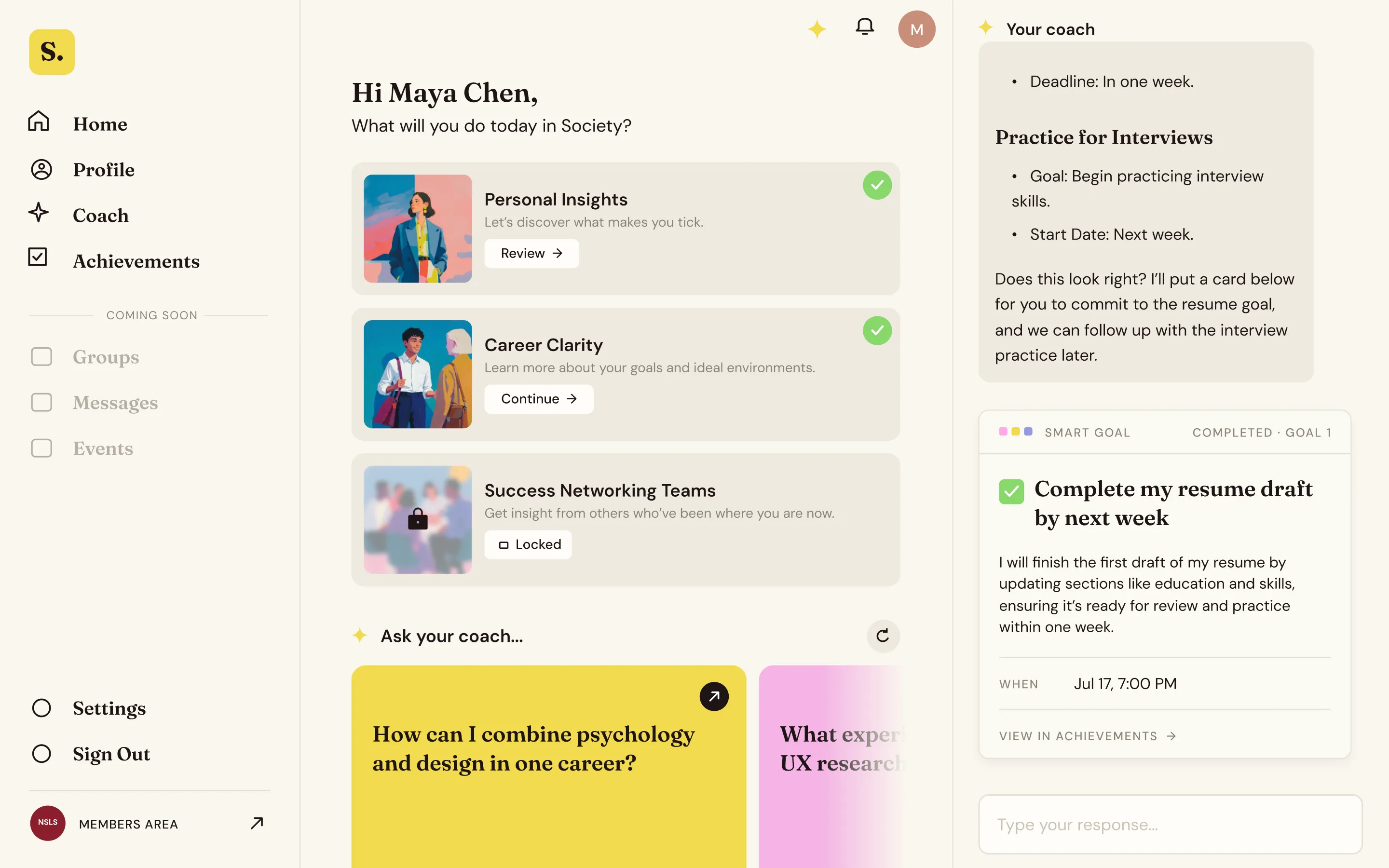
A home to come back to. The original flow had nowhere to land. I proposed a home screen where a student picks up where they left off, reaches their coach directly, and sees the features we had promised, like peer groups, as upcoming parts of the product. Together with the new information architecture, the home screen did the most to drive completion: students could see what was left and get back to it.
Intros that set expectations. Intros work at both levels. A track intro sets the scene for the whole book: what it covers, how long it takes, and what the coach will learn about the student along the way. A section intro, like “Up next: Strengths”, kicks off a chapter in a sentence or two. Either way a student knows what they’re getting into, and why, before they start.
Basic details in one place. The chat collected a student’s name, school and location one message at a time. We put them in one short section with standard inputs, and most of it didn’t need asking: every student signed in with their NSLS account, so we pulled in what NSLS already had and asked them to confirm it.
A readiness baseline up front. The career readiness questions became a quick confidence check students set themselves with sliders, one area of their career at a time. That first reading told the coach where a student felt least prepared, before it asked anything else.
A student fills in a short intake, school, program and expected graduation, then answers a set of readiness questions, each on a one-to-ten scale: career focus, professional skills, professional network, mentorship, leadership, and location and finances. As they rate each area, a six-part readiness radar fills in one colored wedge at a time until the whole chart is complete.
Full-screen cards and familiar inputs. Open-ended questions are the hardest kind to answer. Full-screen cards with taps, pills and dropdowns made each question quick to recognize and answer, and open-ended thinking moved to the coach conversation. Where a question did need an open answer, I seeded it with starter pills to pick, combine or rewrite, so no student faced a blank box.
Going back to change an answer. Not being able to revise was the most common complaint in the old chat. A reviewing mode lets students step back through earlier answers, and changing one tells them what it will affect before they commit.
AI that reflects you back. This is where the principle earned out. Making every step a conversation, the way the original flow did, buried the structure and wore students out before they reached anything useful. So the AI stayed out of the structured tracks and showed up in the two places reflection pays off: a recap at the end of each track, and an optional conversation right after it.
We also explored ways to show the coach learning, since the original never did: framing setup as training your coach, a strength meter on the dashboard, a progress percentage, a screen between sections where the coach updates its picture of the student, and a readiness score by area.
Decision
Where the AI shows up
Considered
AI throughout
Every step is a conversation. Flexible, but slow and tiring, and it hides the structure.
Chosen
AI at the moments that matter
Follow-up options, a personal recap at the end of each track, and an optional coach conversation.
The end-of-track recap turns everything a student just shared into a plain-language read of where they are and a saved plan with concrete first steps. It’s the payoff: proof the coach was listening, and the reason to keep going. Then they can open a chat to dig deeper, add context, or correct something.
Also in the build. Three more changes shaped the final build without being part of the walkthrough above.
- Save and resume. Progress saves as a student goes, so they can leave partway through a track and pick up where they left off. That was the request students typed into the old chat most plainly.
- Achievements and personas. I proposed the achievement engine: a student’s readiness readings and goals sort them into one of four personas, and the system turns their big goals into concrete, trackable achievements. A student can also generate new ones in the coach chat.
- Plain-language copy. Society had introduced itself as too many ambiguous things. Working with a UX content writer, I rewrote the UX copy outside the tracks, so the product says what it is and what a student gets from it.
Build
I set what the AI should say and why. Engineering made it bounded, fast and repeatable.
What I specified and what engineering built. I introduced the pattern: use AI to reflect back what we have learned, in a way that makes a student feel unique and valued. The AI engineer built the feedback loops behind it. After each section the system analyzes what the student just shared and reads it back within set character limits and a fixed format, so every recap fits its place in the interface.
When the read is thin or wrong. A student can open the coach chat to amend it, or go back in the flow and change the specific answers it was built from.
Latency. In the continuous chat, some answers took a long time to process before the next question appeared, because the system was handling too much behind the scenes in one thread. Breaking the flow into smaller tracks and sections cut that wait.
Prototyping in code. We built prototype flows and features in Claude Code and ran new tests within the same week. Much of the work moved out of Figma: where I once designed every flow and state, a few guiding screens were enough, and the iteration happened in code. I tested the radar chart against sliders, the AI summaries at the end of sections, different home screens, and the information architecture changes this way.
Outcome
In the live product, most students who start a track finish it, onboarding takes less than half the time it did, and most leave the coach’s read of them as it was.
63 to 76 percentOf students who start a track, finish itLive product, 90 days: Welcome 76%, Personal Insights 63%, Career Clarity 76%
12 to 15 minAverage time to finish, down from over half an hourMeasured in product
54 to 67 percentFinished the Welcome track, before and after moving the importOf students who started Welcome
4 in 5Left the coach's read of them unchanged when asked to check itA signal, not proof: leaving it alone is also the easy choice
What these numbers are, and what they aren’t. The completion rates are measured in the live product: of students who started a track, the share who finished it. I don’t have an equivalent rate for the original chat, because it couldn’t be measured as a funnel: a single conversation has no steps to count. What I know is that only a handful of members in each invited batch finished it. We also changed what onboarding required, so even a rough comparison wouldn’t be like for like. I can show where the redesign landed, not a clean before-and-after lift. Being able to measure it at all was part of the result: once the flow had discrete steps, we could see where students dropped off, which is how the import problem surfaced within weeks. The students also came from chapters that had opted in, with leaders encouraging members who pay $95 for their membership, so these rates run higher than a consumer app would see cold. And finishing a track isn’t the end goal: a member counted as activated after finishing the required core, Welcome and Personal Insights, and the program was working toward 50,000 activated members.
Against the 70% completion target I had set before anything was built, Welcome and Career Clarity cleared it at 76%, and Personal Insights, the longest track, fell short at 63%. Time to finish came in at 12–15 minutes against a goal of under 12.
Here’s the new direction the redesign set: first as screens, then as a click-through.
A click-through of the redesign: a welcome from the career coach, then quick structured steps for name, details, location, photo, current path and education, a set of confidence sliders, and a list of goals to select. The coach then asks four specific follow-up questions about the student's own answers, checks whether anything is missing, and offers to put together their goals and action plan.
Answers got richer too: when we pre-filled what we already knew and asked specific follow-up questions, students added detail instead of skipping.
To check whether the recaps landed, we added a “does this look accurate?” step at the end of each major section, so a student could correct what the coach had learned. Only about 2 in 10 changed anything. I read that as a signal, not proof: leaving a summary alone is also the easy thing to do, and it would take edit rates by section, or students’ own words, to call the reflections accurate.
After launch we kept testing, and one change backfired in a way worth keeping in the story. We added a LinkedIn and resume import to the Welcome track to pre-fill work and education history, and the share of students finishing the Welcome track dropped to 54% in the weeks after. Asking for that much, that early, was too much. I worked with the designer on NSLS’s own onboarding to find the fix: we moved the import into Career Clarity, the track it actually belonged to, since that is where background, skills and interests come up. Welcome completion recovered to 67%, and measured 76% over a later 90-day window. Where you ask turned out to matter as much as what you ask.
Import in Welcome54%finished Welcome, in the weeks after release
- WelcomeLinkedIn / resume import
- Personal Insights
- Career Clarity
- Coach Chat
Import in Career Clarity67%finished Welcome, after the move
- Welcome
- Personal Insights
- Career ClarityLinkedIn / resume import
- Coach Chat
Reflection
Anyone can chat with AI. The value is in turning it into insights that drive real outcomes.